Phase I: Define the Assignment
The concept behind this assignment was to get into the habit of developing a process to which we investigate sources of inspiration or Design Spark, to establish a direction of thought and to help guide us in the creation of our posters. We were asked to choose a event in which to create three different poster designs aimed at a perticular group. The event I had choosen was the Delaware Auto Show and my audience I picked to pitch this idea towards was my wife, whom shares my love for automobiles. The targeted group here is the 30 to 50 age class.
Phase II: Discovery Three Design Sparks
1. The Collector’s Books of Books by Eric Quayle. Call # 2987. Q34 1971
2. Sensuous Architecture by Christian W. Thomsen. Call # NA 203. T5213 1998
3. Hokusai, First Manga Master by Jocelyn Bouquillard and Christophe Marquet. Call # NC 353. K3 A65 2007
Phase III: Design Three Posters


1. The spark from “The Collectors Books of Books” had given me the idea of the older and more nostalgic automobiles from the turn of the 20th century,combined with the text within the ensuing pages which practically leaped out at me as to say look no further, your inspiration is here, so i ran with it!
2. The Idea that had emerged from “Sensuous Architecture” was one that had posed more of a problem in terms of designing or the merging of an image with text that would have been equally functional and pleasing to the eye, much the same way that building are.
3. Although the concept visual is not present at this time, allow me to say that this was a dismal and utter failure.
Phase IV: Refine One Poster
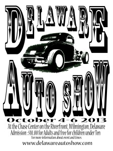
Perhaps one of the most important design decisions that was made was the choice of type that would go best with the image being presented. Agonizing thoroughly in Photoshop, having previewed a plethora of fonts, I had decided that this one font worked best to communicate to the target audience in line with the whole nostalgia feel of those “Good old days”!
Phase V: Deliver The Final Poster
This final design layout combines many different elements which are geared towards attracting my targeted audience. First there is the older and muscular vehicle working hand-in-hand with the Ariel text to convey the sense of a simpler yet more adventurous point in American Muscle Car history. What also is working here is the background, suppling a foundation for the imagery. The wood-grain seems to express a wild and unyielding presence, much like the “Wild West”! I feel that this works well in juxtaposition with the modern text giving the viewer a mix of the old and the new together.
